How to Choose a Wedding Color Palette That Matches Your Style

Today, I want to share everything I’ve learned about selecting a wedding color palette that truly reflects who you are as a couple. Whether you’re drawn to romantic blush tones, bold jewel hues, or the earthy colors of our gorgeous Northern Ontario landscape, I’m here to help you navigate this important decision.

Hey there, lovely couples! I’m Brooke Murray, a wedding photographer based right here in beautiful Sudbury, and I’ve had the incredible privilege of capturing hundreds of weddings over the years. One of the most exciting—and sometimes overwhelming—parts of wedding planning is choosing your color palette. I’ve seen firsthand how the right colors can transform a wedding from beautiful to absolutely breathtaking, and how they can tell your unique love story through every detail I capture.
Today, I want to share everything I’ve learned about selecting a wedding color palette that truly reflects who you are as a couple. Whether you’re drawn to romantic blush tones, bold jewel hues, or the earthy colors of our gorgeous Northern Ontario landscape, I’m here to help you navigate this important decision.
Why Your Color Palette Matters More Than You Think
Before we dive into the how-to, let’s talk about why your color palette is such a crucial element of your wedding day. As a photographer, I can tell you that your colors set the entire mood and atmosphere of your celebration. They influence everything from your floral arrangements and bridesmaids’ dresses to your table settings and even how your photos will look.
When I’m editing your wedding gallery, cohesive colors create a stunning visual story that flows seamlessly from one moment to the next. A well-chosen palette makes your photos feel timeless and intentional, rather than scattered or dated. I’ve photographed weddings with every color scheme imaginable, and the ones that stand out are always those where the couple chose colors that genuinely resonated with their personal style.
Start With What You Already Love
Look to Your Own Life for Inspiration
The best place to start when choosing your wedding colors is by looking at what already surrounds you. Take a moment to look around your home. What colors dominate your space? What shades make you feel calm, happy, or energized? Your wedding should feel like an authentic extension of who you are, not like you’re playing dress-up for someone else’s vision.
I always encourage my couples to think about their favorite spaces—maybe it’s that cozy coffee shop in downtown Sudbury where you had your first date, or perhaps it’s the natural beauty of Lake Ramsey at sunset. These meaningful places often hold color inspiration that will make your wedding feel deeply personal.
Consider Your Personal Style
Are you someone who gravitates toward neutrals and minimalist aesthetics? Or do you love bold patterns and vibrant hues? Your everyday style preferences are a goldmine for wedding color inspiration. If you typically wear soft, romantic colors, a pastel palette might feel most like “you.” If your wardrobe is full of rich, deep tones, don’t be afraid to bring that sophistication to your wedding day.
I’ve photographed couples who wore their favorite colors throughout their day—from the bride’s shoes to the groom’s socks—and these personal touches always translate beautifully in photos. They add character and authenticity that you can’t fake.
Understanding Color Psychology and Mood
The Emotions Behind Different Colors
Colors evoke emotions, and understanding this can help you create the exact atmosphere you want for your wedding. Let me break down what different color families tend to communicate:
Soft and Romantic
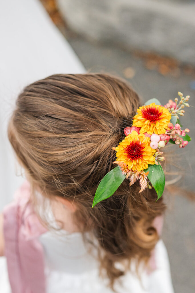
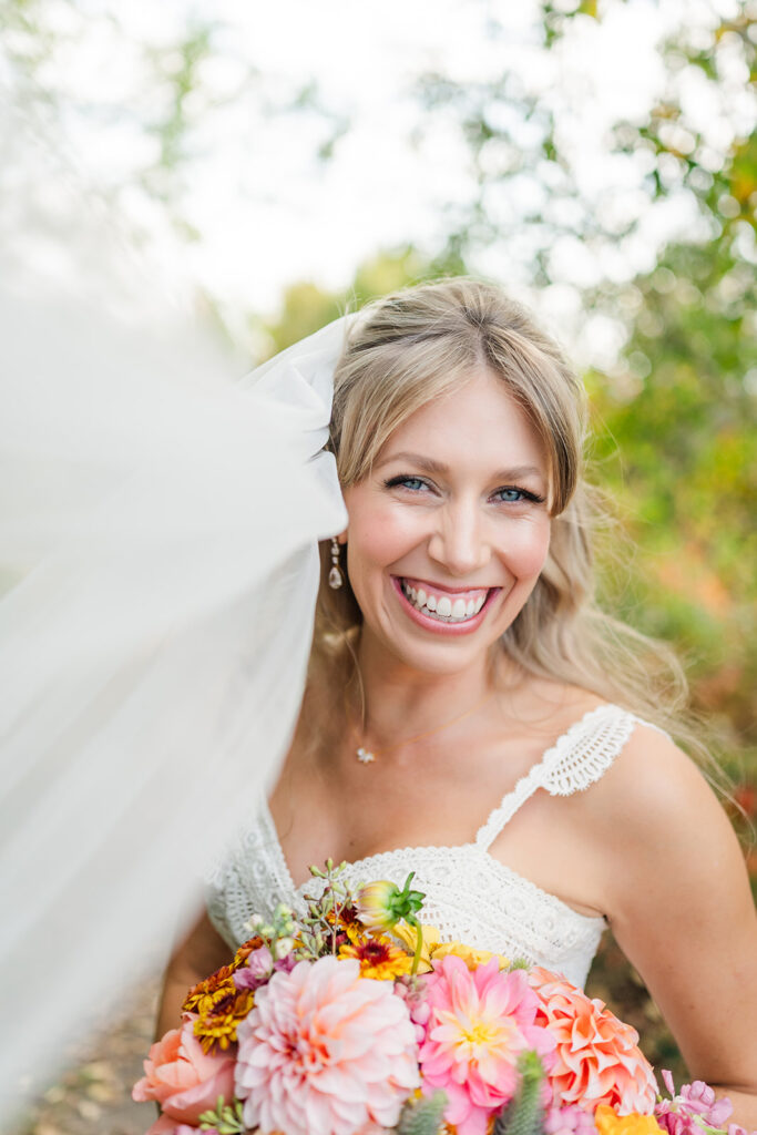
Blush pink, ivory, champagne, and soft lavender create an ethereal, romantic feeling. These colors photograph beautifully in natural light and are perfect for couples who want a dreamy, fairy-tale aesthetic. Here in Sudbury, these tones look stunning against our natural landscapes, especially during golden hour.
Bold and Dramatic
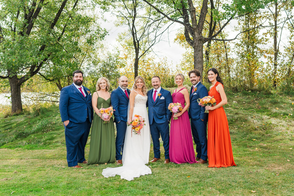
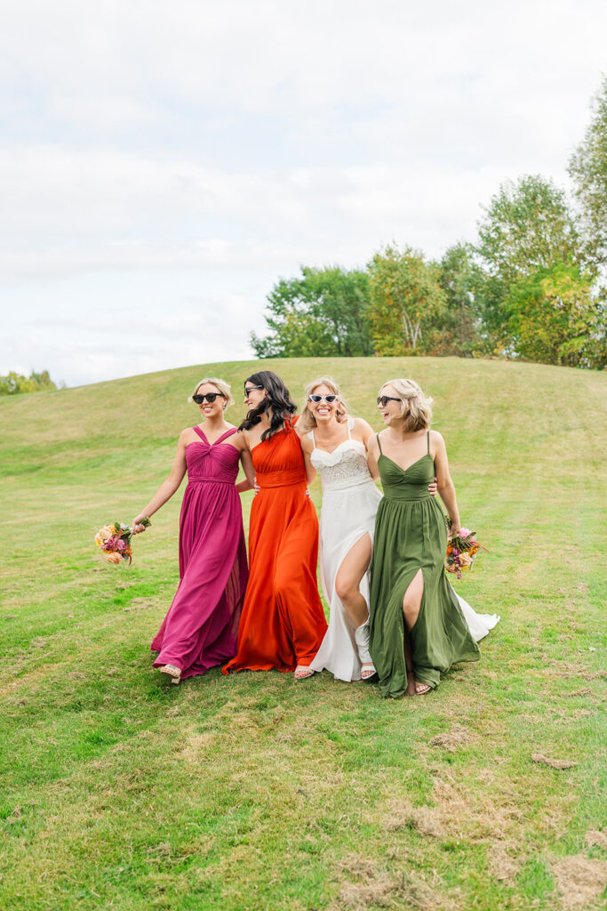
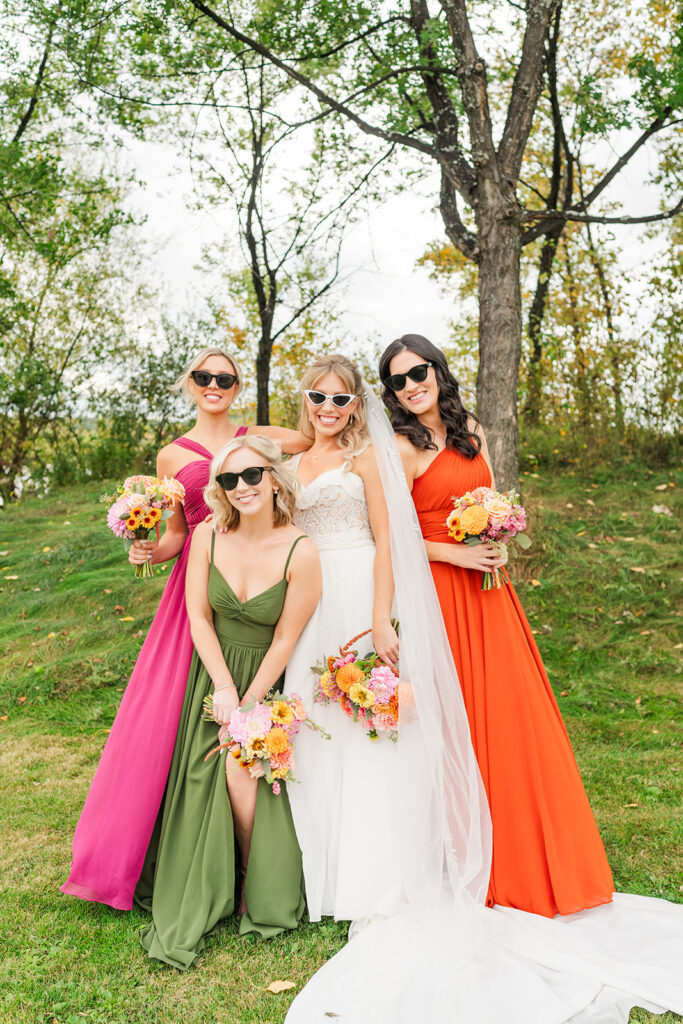
Deep burgundy, navy, emerald green, and rich plum convey sophistication and drama. These jewel tones are having a major moment right now, and for good reason—they create incredible depth in photographs and work beautifully for fall and winter weddings.
Fresh and Vibrant
Coral, yellow, turquoise, and bright pink bring energy and joy to your celebration. These colors are perfect for summer weddings and couples who want their day to feel fun and lively. They pop beautifully in photos, especially in outdoor settings.
Natural and Earthy
Sage green, terracotta, cream, and warm browns create an organic, grounded feeling. These colors are ideal for couples who love nature and want to incorporate Sudbury’s stunning natural environment into their day. They work particularly well for rustic or outdoor weddings.
Matching Your Palette to Your Wedding Vibe
Think about the overall feeling you want guests to experience at your wedding. Is it intimate and romantic? Fun and celebratory? Elegant and formal? Your color palette should support this vision. A formal black-tie affair might call for classic combinations like black, white, and gold, while a relaxed outdoor ceremony might embrace softer, nature-inspired tones.
Practical Tips for Building Your Palette
Start With a Base Color
Choose one main color that you absolutely love—this will be your anchor. This could be the color of your bridesmaids’ dresses or the dominant shade in your floral arrangements. From there, you’ll build out supporting colors that complement and enhance your base choice.
I always recommend choosing a color that photographs well and that you genuinely love, not just what’s trending. Trends come and go, but your wedding photos are forever. That said, if you love a trendy color, go for it! Just make sure it’s something you connect with personally.
Add Complementary Colors
Once you have your base color, add two to three complementary shades. A good rule of thumb is to include:
- A neutral (white, cream, beige, gray, or black)
- A lighter version of your main color or a complementary soft tone
- An accent color for pops of interest
This three-to-four color formula creates visual interest without feeling overwhelming or chaotic. It gives you enough variety to play with different design elements while maintaining cohesion throughout your day.
Don’t Forget About Neutrals
Neutrals are the unsung heroes of wedding color palettes. They provide breathing room and allow your feature colors to shine. White, cream, beige, gray, and even black can ground your palette and add sophistication. In my experience photographing weddings, neutrals also ensure your photos feel timeless rather than overly trendy.
Seasonal Considerations for Sudbury Weddings
Embracing Our Northern Ontario Seasons
Living and working in Sudbury, I’ve learned that our distinct seasons offer incredible inspiration for wedding color palettes. Each season brings its own natural beauty that can enhance your wedding aesthetic.
Spring: Think soft pastels, fresh greens, and light, airy tones. Spring in Sudbury is all about renewal and growth, with trees budding and flowers beginning to bloom. Colors like soft pink, mint green, pale yellow, and lavender capture this awakening perfectly.
Summer: This is your chance to go bold and vibrant or keep it light and breezy. Our beautiful summer weather allows for outdoor ceremonies by the lake or in one of our gorgeous parks. Consider colors like coral, turquoise, sunny yellow, or even bright white with pops of color.
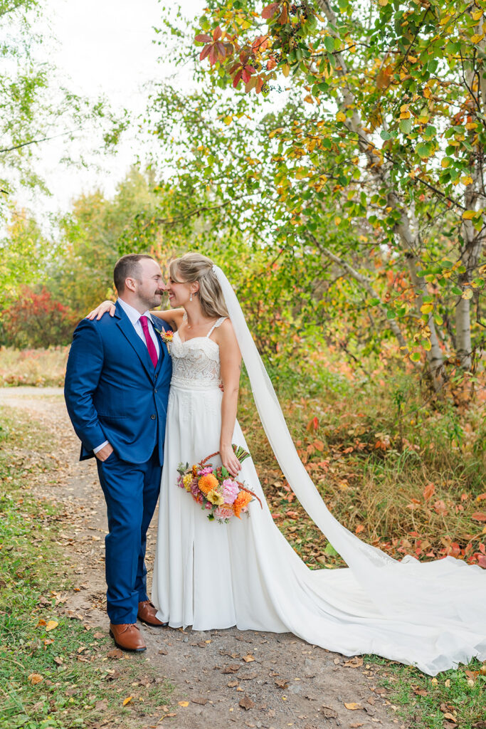
Fall: This is my personal favorite season for weddings in Sudbury. The natural landscape transforms into a stunning display of oranges, reds, and golds. Lean into these rich, warm tones with burgundy, burnt orange, deep red, mustard yellow, and forest green. These colors photograph absolutely beautifully against our fall foliage.
Winter: Winter weddings in Sudbury are magical, especially when we have snow. Embrace the season with rich jewel tones like emerald, sapphire, and ruby, or go for an elegant winter wonderland with silver, white, champagne, and touches of evergreen.
Testing Your Palette Before Committing
Create a Mood Board
Before you make any final decisions, I highly recommend creating a mood board. Gather images, fabric swatches, paint chips, and inspiration photos that feature your potential colors. You can do this digitally on Pinterest or physically with a poster board. Live with it for a week or two and see how you feel.
I often have couples send me their mood boards before their engagement session, so I can understand their vision and suggest locations or styling that will complement their wedding colors. This helps ensure your engagement photos feel cohesive with your overall wedding aesthetic.
Consider How Colors Photograph
This is where my photographer expertise really comes in handy. Not all colors photograph the same way. Some colors that look amazing in person can appear washed out or overly saturated in photos. For example, certain shades of yellow and orange can be tricky in different lighting conditions, while blues and greens typically photograph beautifully.
If you’re unsure about how your chosen colors will look in photos, don’t hesitate to ask your photographer! We have tons of experience and can show you examples from past weddings. I’m always happy to provide guidance on color choices and even suggest slight adjustments that will make your photos even more stunning.
Take a look at my favorite Wedding Venues around Sudbury:
Northern Water Sports Centre
Hilton Garden Inn
The Inn at Gore Bay
Forest Ridge Golf & Country Club
Holiday Inn Sudbury
The Hellenic Center
Idylwylde Golf Course
Maple Hill Farms
Science North and Dynamic Earth
Putting It All Together
Making Your Colors Come to Life
Once you’ve settled on your palette, it’s time to weave these colors throughout your wedding day. Think about:
- Bridesmaids’ dresses and groomsmen’s ties or suits
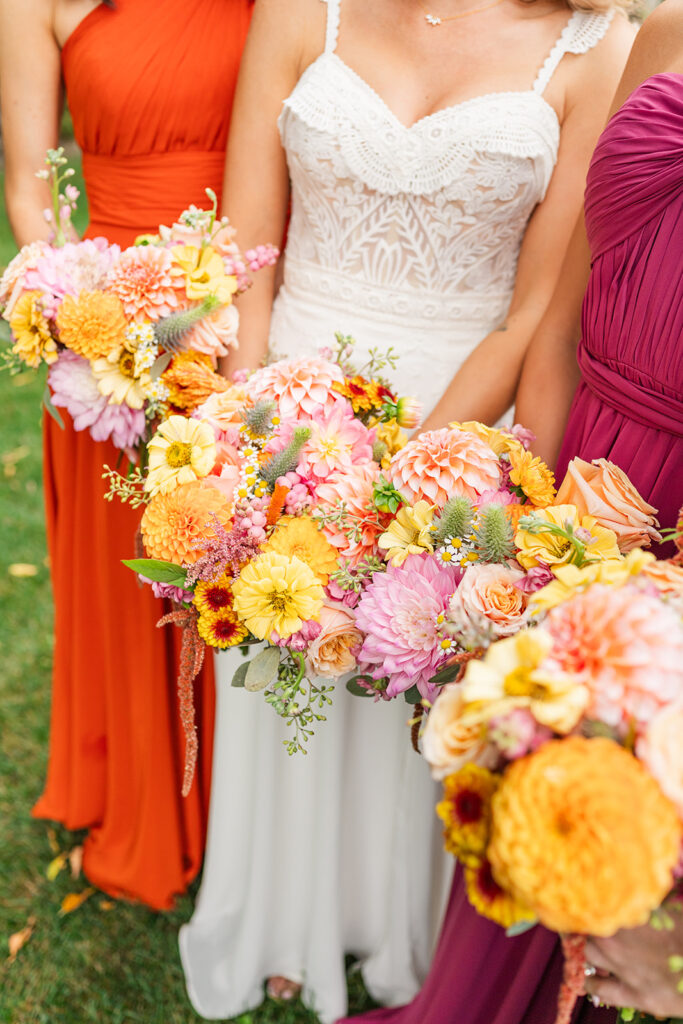
- Floral arrangements and bouquets
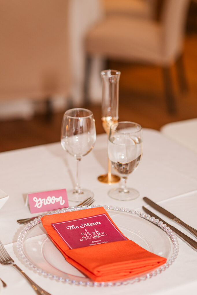
- Table linens, napkins, and place settings
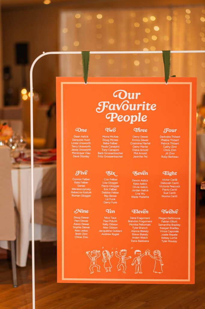
- Stationery, from invitations to menus
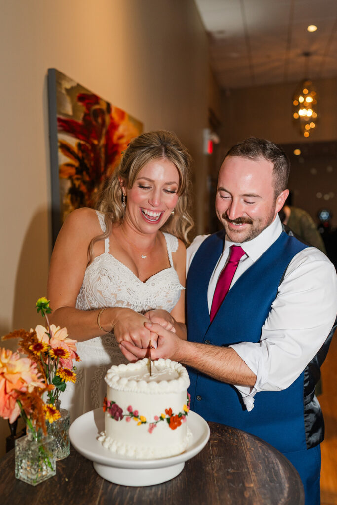
- Cake design and dessert displays
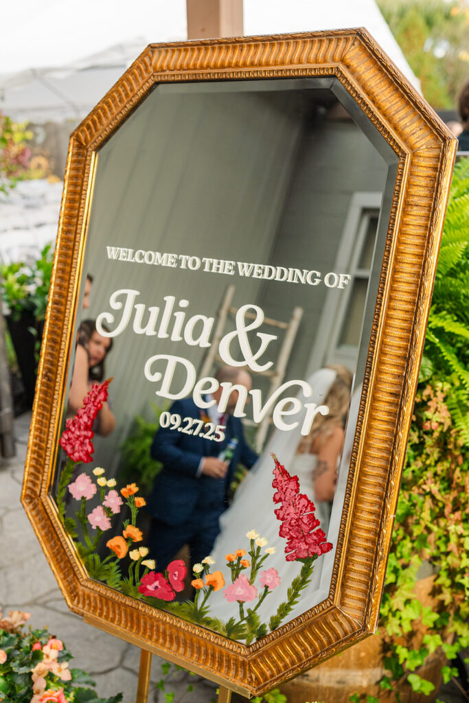
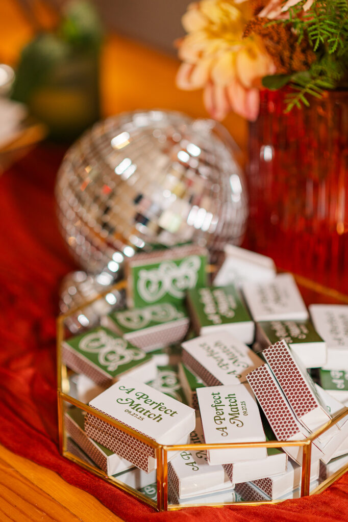
- Signage and décor elements
The key is balance. You don’t need to use all your colors in equal amounts everywhere. Let your main color be the star, and use your accent colors strategically for visual interest and depth.
Trust Your Instincts
At the end of the day, your wedding colors should make you excited and happy. If a particular palette makes your heart skip a beat, that’s probably the right choice, regardless of what’s trending or what anyone else thinks. Your wedding is a celebration of your unique love story, and your colors should reflect that individuality.
I’ve photographed weddings with traditional color schemes and weddings with completely unexpected combinations, and you know what makes them all beautiful? When the couple genuinely loves their choices and puts their personal stamp on every detail.
Final Thoughts from Behind the Lens
Choosing your wedding color palette is such a fun and creative part of the planning process. As your photographer, I’ll be there to capture every beautiful detail you’ve thoughtfully selected, from the subtle blush tones in your bouquet to the rich burgundy of your bridesmaids’ dresses. The right color palette will not only make your day feel cohesive and intentional but will also result in a wedding gallery that you’ll treasure for a lifetime.
Remember, there’s no wrong choice when it comes to your wedding colors—only what feels right for you. Trust yourself, have fun with the process, and don’t be afraid to break the rules if something speaks to you. Some of the most beautiful weddings I’ve photographed have been the ones where couples fearlessly embraced unexpected color combinations that perfectly reflected their personality.
If you’re planning a wedding here in Sudbury or the surrounding area and want to chat about your color palette or anything else wedding-related, I’m always here to help! I love being a resource for my couples beyond just taking photos. Let’s create something beautiful together that tells your unique story in living color.

